tamuです。
lightning-comboboxを試してみました。
comboboxとは
いわゆる選択リストです。HTML要素でいうところの <select> タグです。
最小コード
選択リスト値を表示するのにどうしてもJS側のコードが必要になります。
1
2
3
| <lightning-combobox
options={options}>
</lightning-combobox>
|
選択リスト値の中身はgetterで定義してます。
 1
 2
 3
 4
 5
 6
 7
 8
 9
10
11
| import { LightningElement } from 'lwc';
export default class Combobox extends LightningElement {
get options() {
return [
{ label: 'option1', value: 'option1' },
{ label: 'option2', value: 'option2' },
{ label: 'option3', value: 'option3' },
];
}
}
|
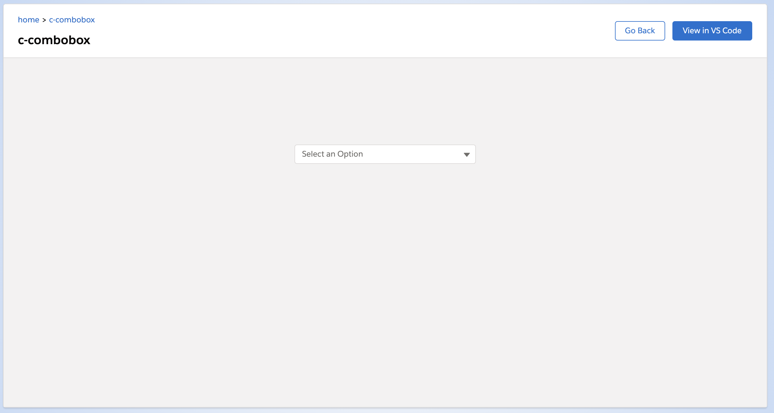
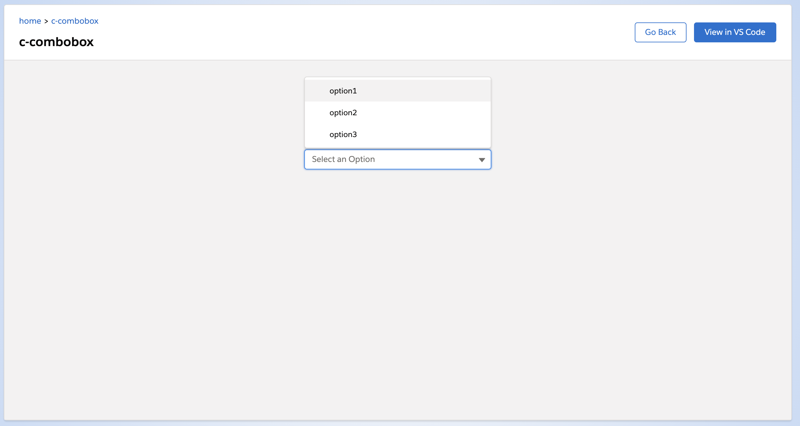
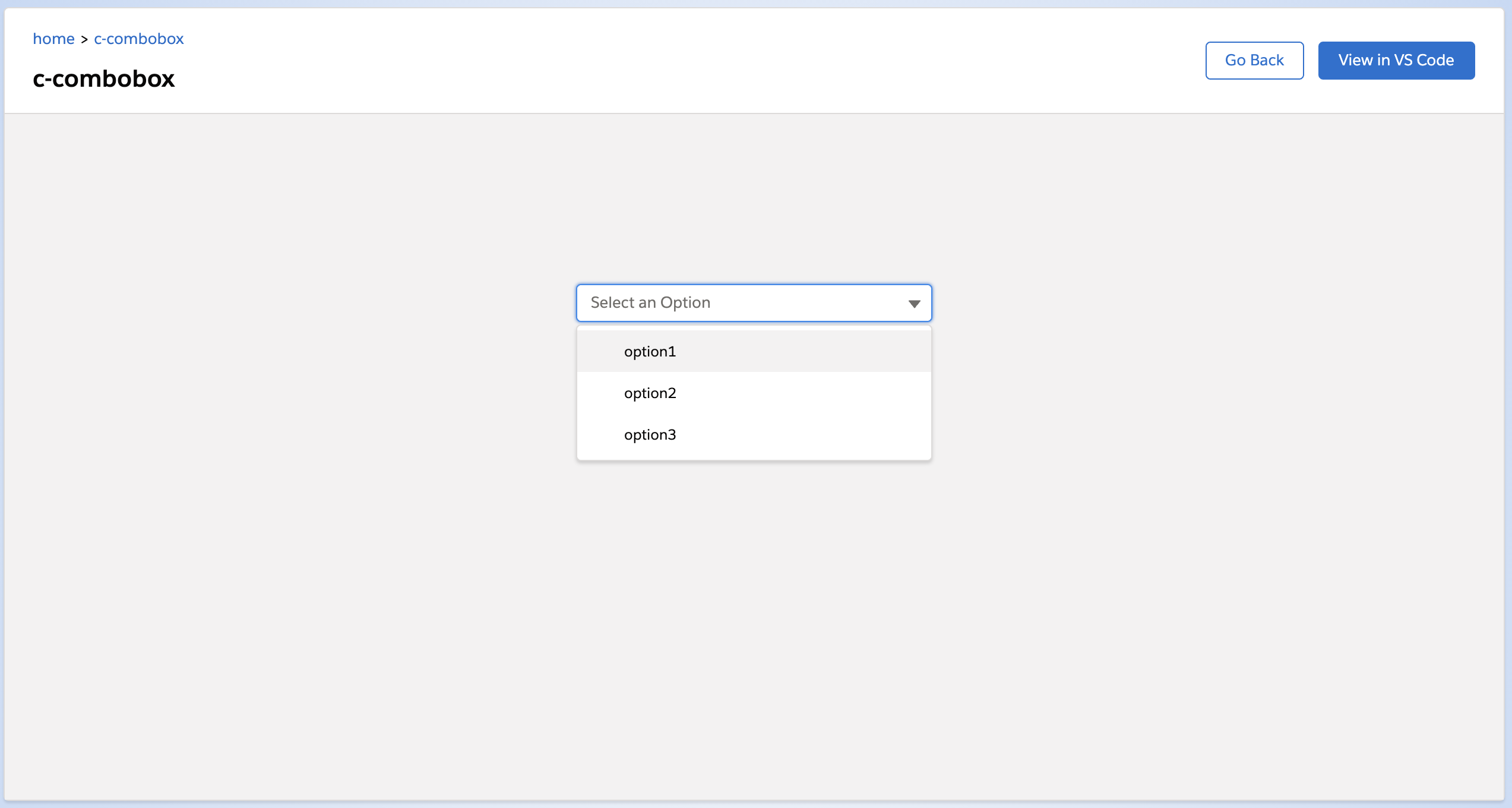
これをローカルサーバで起動するとこんな感じになります。
(実はdivを入れて表示領域を広くしてます)
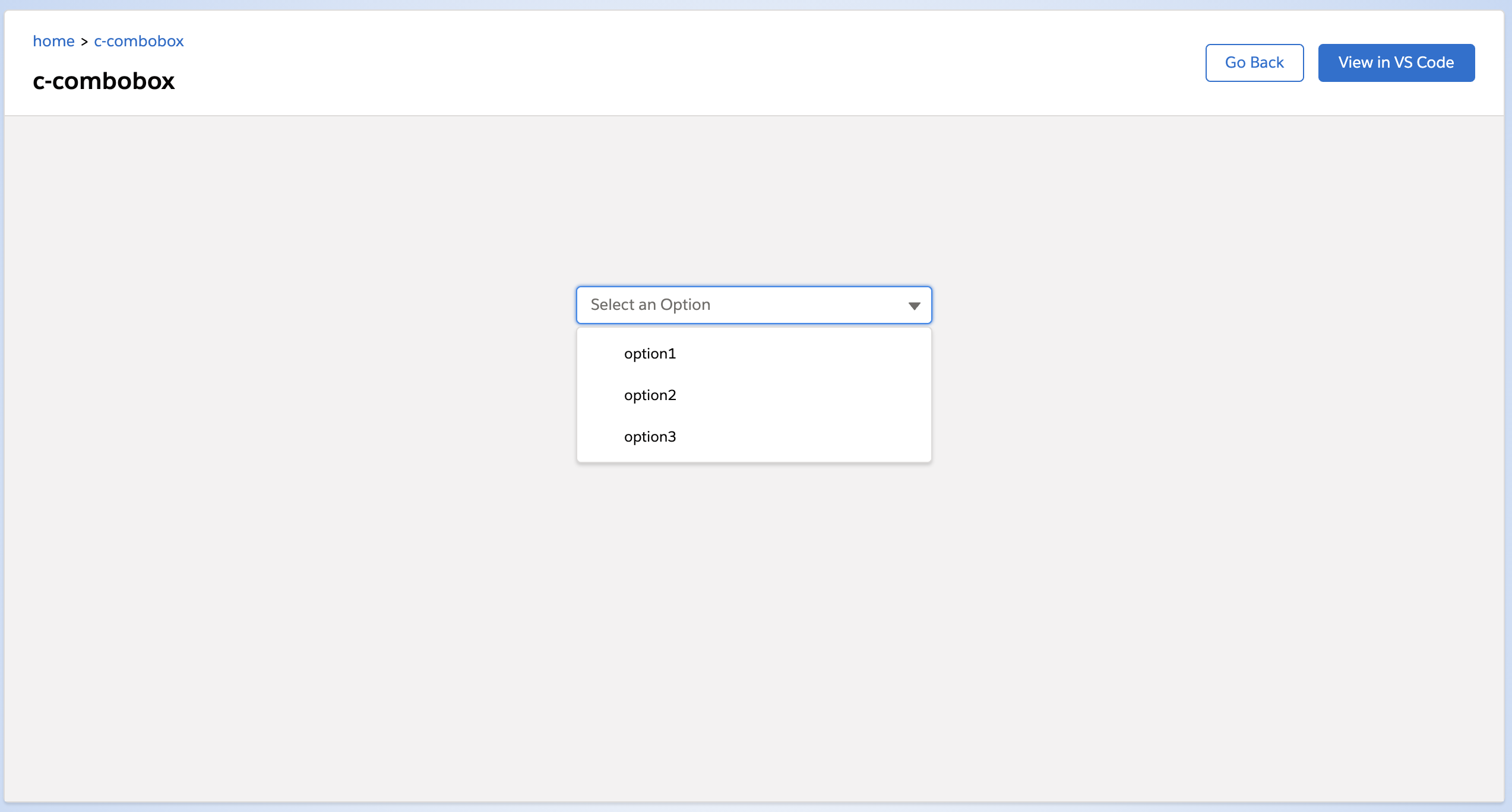
開くとこんな感じです。
attribute
lightning-combobox のattributeは次のとおり。
disabled
無効化するやつです。
1
2
3
4
| <lightning-combobox
options={options}
disabled>
</lightning-combobox>
|
dropdown-alignment
リストがどの位置に表示されるかを指定します。
指定できるのは left, auto, left-bottom です。
left と auto は同じです。
rightとかも指定できますが、見た目にほぼ変わりはないです。
参考: https://github.com/salesforce/base-components-recipes/blob/master/force-app/main/default/lwc/baseCombobox/baseCombobox.js#L443-L453
left
1
2
3
4
| <lightning-combobox
options={options}
dropdown-alignment="left">
</lightning-combobox>
|
bottom-left
1
2
3
4
| <lightning-combobox
options={options}
dropdown-alignment="bottom-left">
</lightning-combobox>
|
参考 right 指定時
1
2
3
4
| <lightning-combobox
options={options}
dropdown-alignment="right">
</lightning-combobox>
|
right を指定しても left と見た目は変わらないです。
(CSSは違うのですが結果的に見え方が同じになっています)
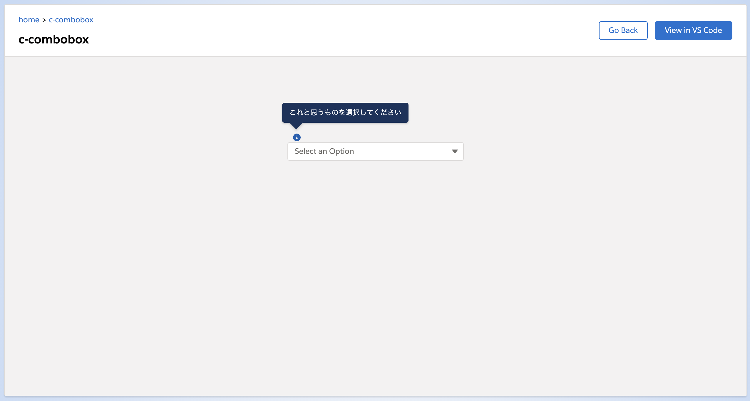
field-level-help
ヘルプテキストを表示します。
Salesforceでおなじみのやつです。
1
2
3
4
| <lightning-combobox
options={options}
field-level-help="これと思うものを選択してください">
</lightning-combobox>
|
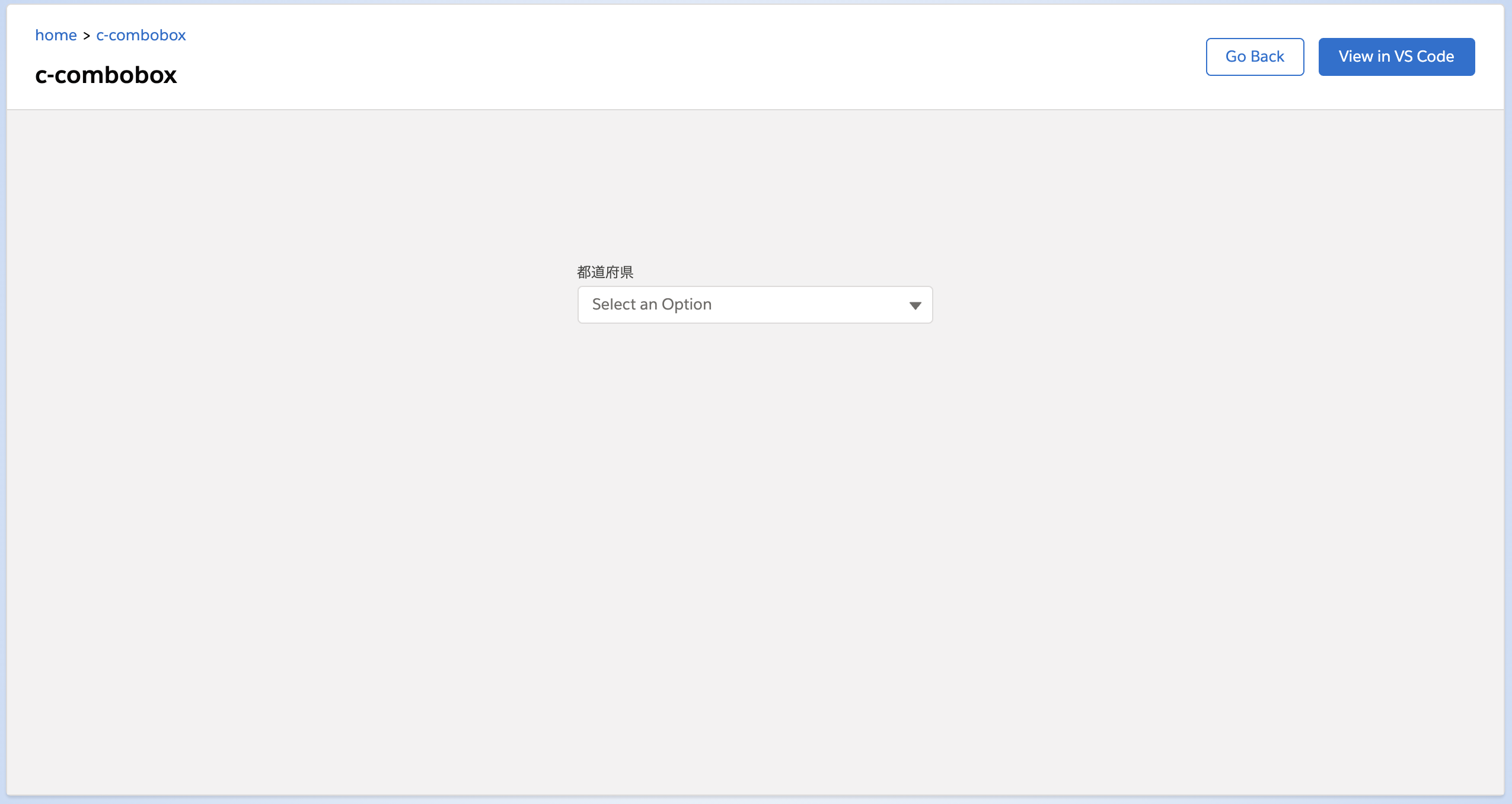
label
ラベルです。
1
2
3
4
| <lightning-combobox
options={options}
label="都道府県">
</lightning-combobox>
|
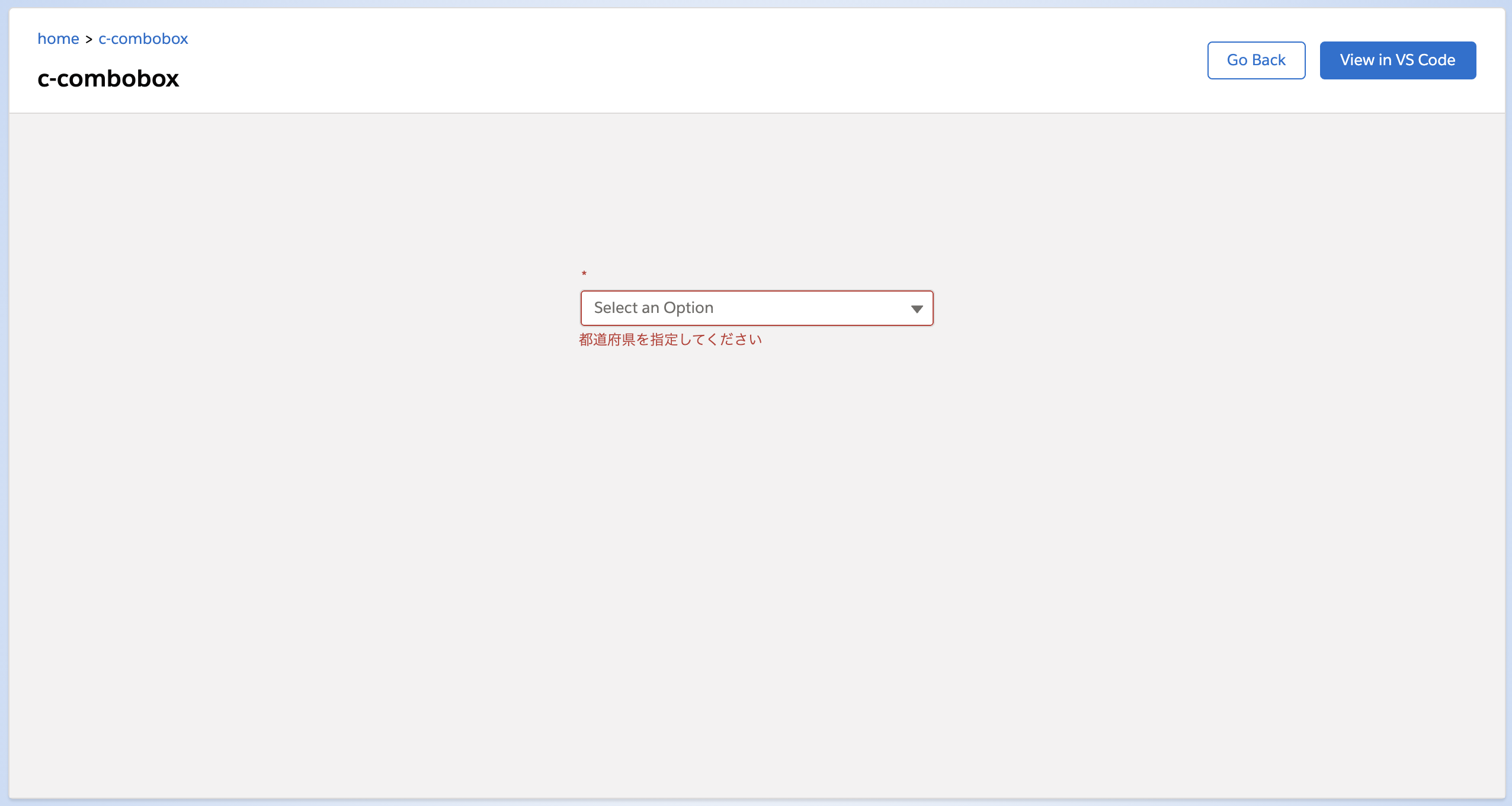
message-when-value-missing
required がついた入力が必須で選択しなかった場合、メッセージを出力します。
required がない場合は message-when-value-missing を指定してもメッセージは出力しません。
1
2
3
4
5
| <lightning-combobox
options={options}
message-when-value-missing="都道府県を指定してください"
required>
</lightning-combobox>
|
初期表示は必須を表すポッチが付いているだけで、メッセージは出力されません。
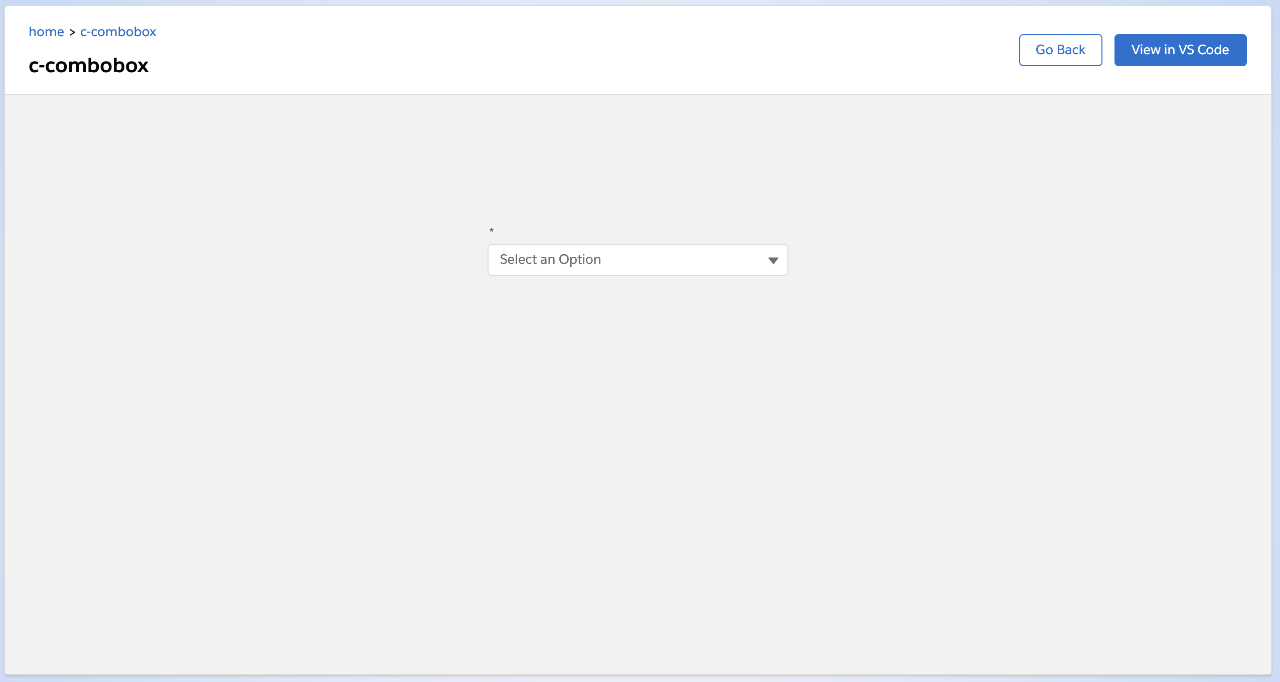
選択項目からあえて何も選択しなかった場合、メッセージが出力されます。
name
<select> タグにおける name と同じです。
options
<select> タグにおける <option> です。 lightning-combobox には options の指定が必須です。
options には選択肢の配列を返す関数や変数を指定します。
選択肢には label と value が必要になります。
1
2
3
| <lightning-combobox
options={options}>
</lightning-combobox>
|
関数で指定した場合
 1
 2
 3
 4
 5
 6
 7
 8
 9
10
11
| import { LightningElement } from 'lwc';
export default class Combobox extends LightningElement {
get options() {
return [
{ label: 'option1', value: 'option1' },
{ label: 'option2', value: 'option2' },
{ label: 'option3', value: 'option3' },
];
}
}
|
変数で指定した場合
1
2
3
4
5
6
7
8
9
| import { LightningElement } from 'lwc';
export default class Combobox extends LightningElement {
options = [
{ label: 'option1', value: 'option1' },
{ label: 'option2', value: 'option2' },
{ label: 'option3', value: 'option3' },
];
}
|
LWCで連動選択リストを作りたいときは関数で指定するのが良いんじゃないかと思います。
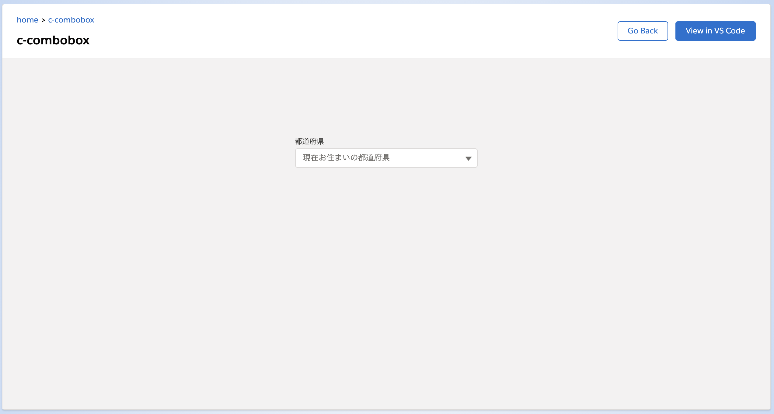
placeholder
何も選択していなかったときに表示するテキストを指定します。
デフォルト値は Select an Option です。
1
2
3
4
5
| <lightning-combobox
options={options}
label="都道府県"
placeholder="現在お住まいの都道府県">
</lightning-combobox>
|
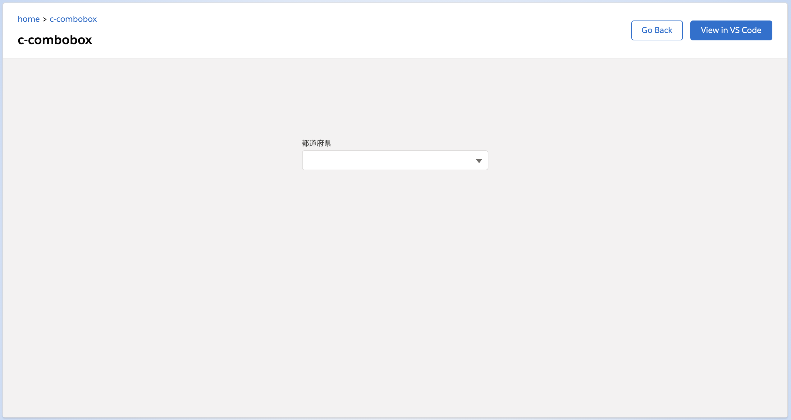
ただ、普通にSalesforceを使っていると選択リストに placeholder って指定しているのを見た覚えがないです。
入力項目なら姓名のサンプルが入っているときがありますが、選択リストでサンプルって必要かな?と。
こんな感じで空文字を指定するのも良いかなと思ったりします。
1
2
3
4
5
| <lightning-combobox
options={options}
label="都道府県"
placeholder="">
</lightning-combobox>
|
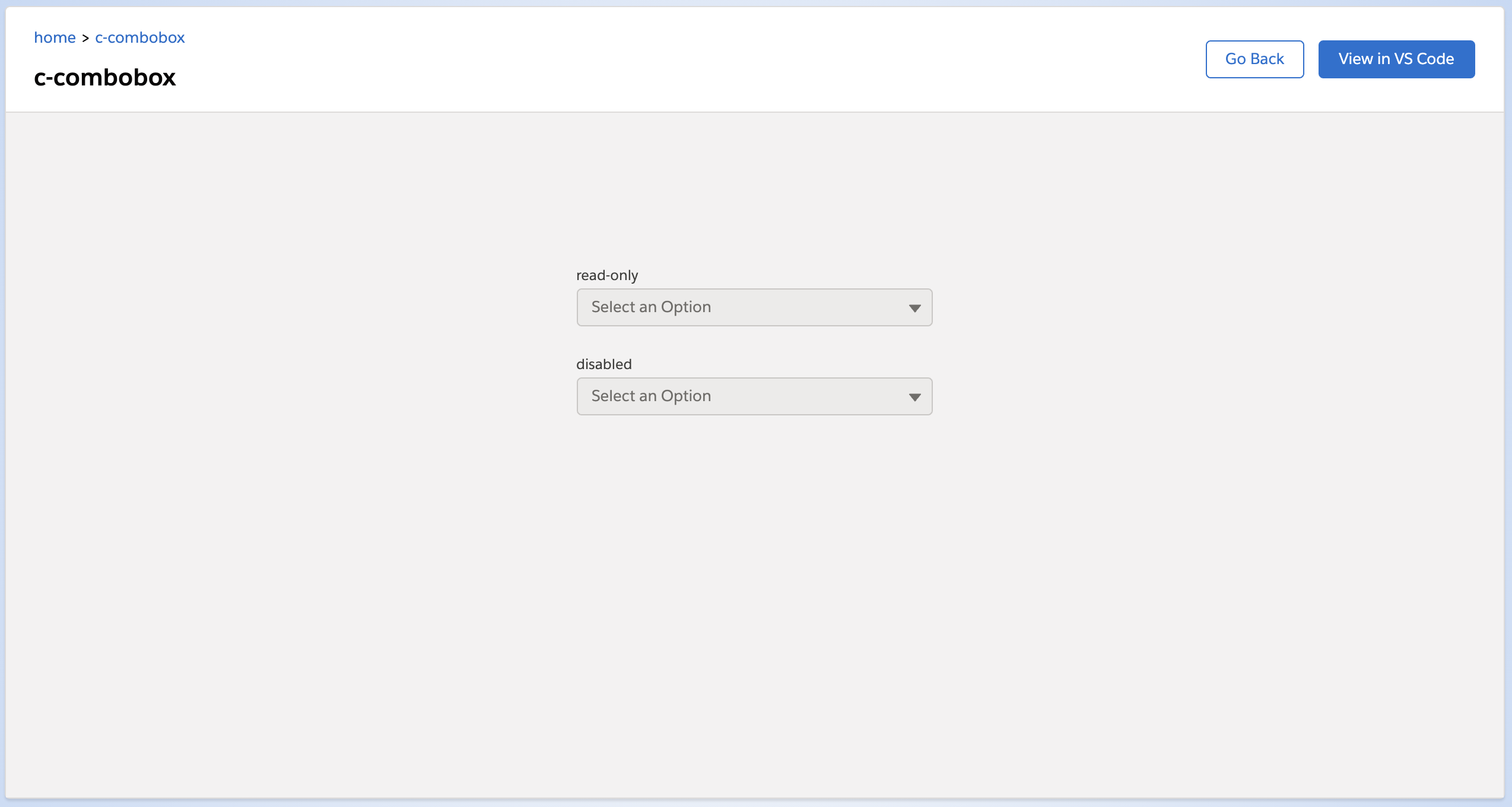
read-only
これが指定されると読み取り専用になります。
disabled が指定されたのと同じで、DOM的にも同じものが出力されます。
Web-to-ケースのように <form> で送る場合は disabled なので値が飛んでいかないことにご注意ください。
 1
 2
 3
 4
 5
 6
 7
 8
 9
10
11
12
13
| <lightning-combobox
name="combo1"
options={options}
label="read-only"
read-only>
</lightning-combobox>
<br />
<lightning-combobox
name="combo2"
options={options}
label="disabled"
disabled>
</lightning-combobox>
|
見た目は read-only も disabled も同じです。
required
入力必須を表します。
Web-to-ケースのように <form> で送る場合は、 required がついていても関係なく submit は押せてしまうので注意が必要です。
1
2
3
4
| <lightning-combobox
options={options}
required>
</lightning-combobox>
|
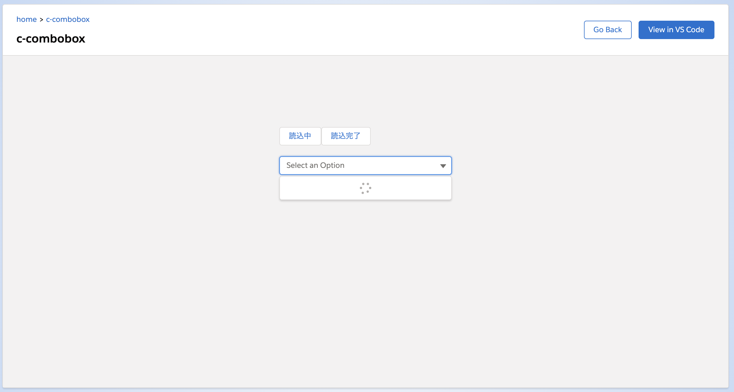
spinner-active
これが存在する場合は選択リストに読込中のアイコンを表示します。
ちょっとわかりにくいのですが、 spinner-active が true の場合は読込中アイコンを表示、
spinner-active が false のときはその表示がありません。
ボタンで読込中アイコンの制御をしてみます。
また、アイコンを表示する際は options にリストを出さないようにします。
1
2
3
4
5
6
7
| <lightning-button label="読込中" onclick={setSpinnerActive}></lightning-button>
<lightning-button label="読込完了" onclick={setSpinnerDeactive}></lightning-button>
<br />
<lightning-combobox
options={options}
spinner-active={spinnerActive}>
</lightning-combobox>
|
 1
 2
 3
 4
 5
 6
 7
 8
 9
10
11
12
13
14
15
16
17
18
19
20
21
22
23
24
25
| import { LightningElement } from 'lwc';
export default class Combobox extends LightningElement {
spinnerActive = true;
setSpinnerActive() {
this.spinnerActive = true;
}
setSpinnerDeactive() {
this.spinnerActive = false;
}
get options() {
if (!this.spinnerActive) {
return [
{ label: 'option1', value: 'option1' },
{ label: 'option2', value: 'option2' },
{ label: 'option3', value: 'option3' },
];
} else {
return [];
}
}
}
|
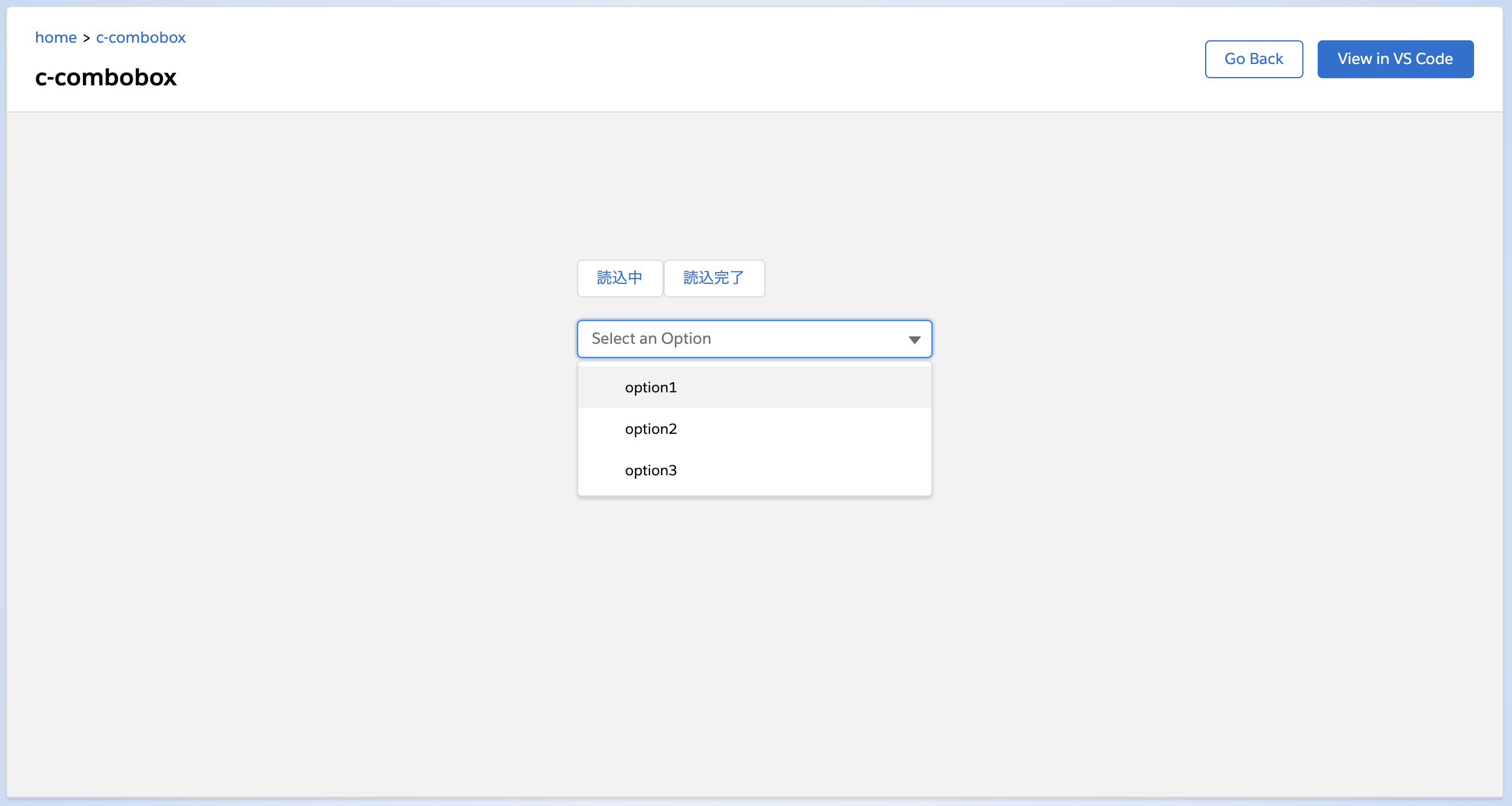
読込中ボタンを押してから選択リストを開くと、読込中アイコンが表示されます。
options() で空の配列を返しているため選択リストは表示されません。
読込完了ボタンを押してから選択リストを開くと、読込中アイコンは表示されず、選択リストのみが表示されます。
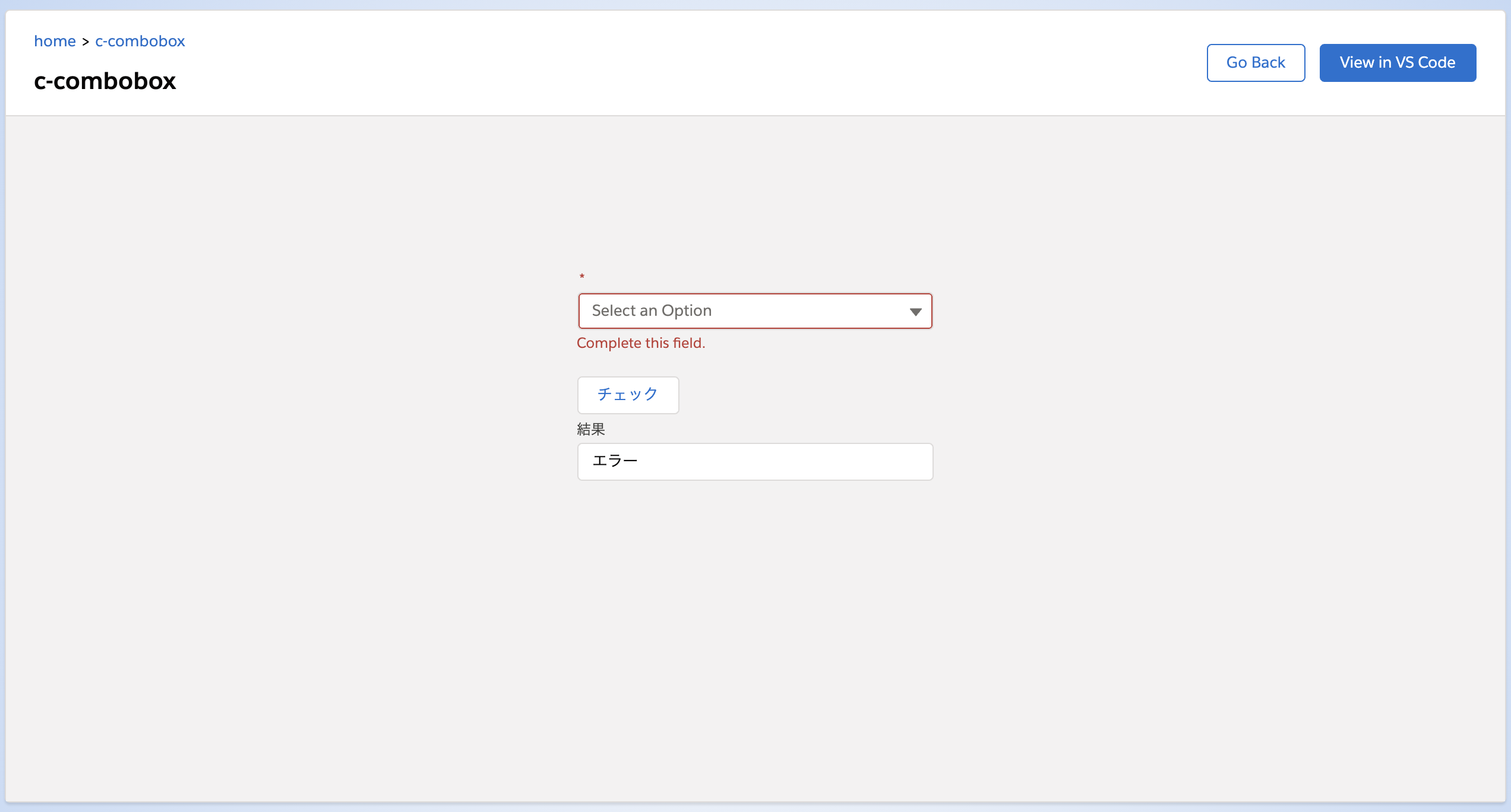
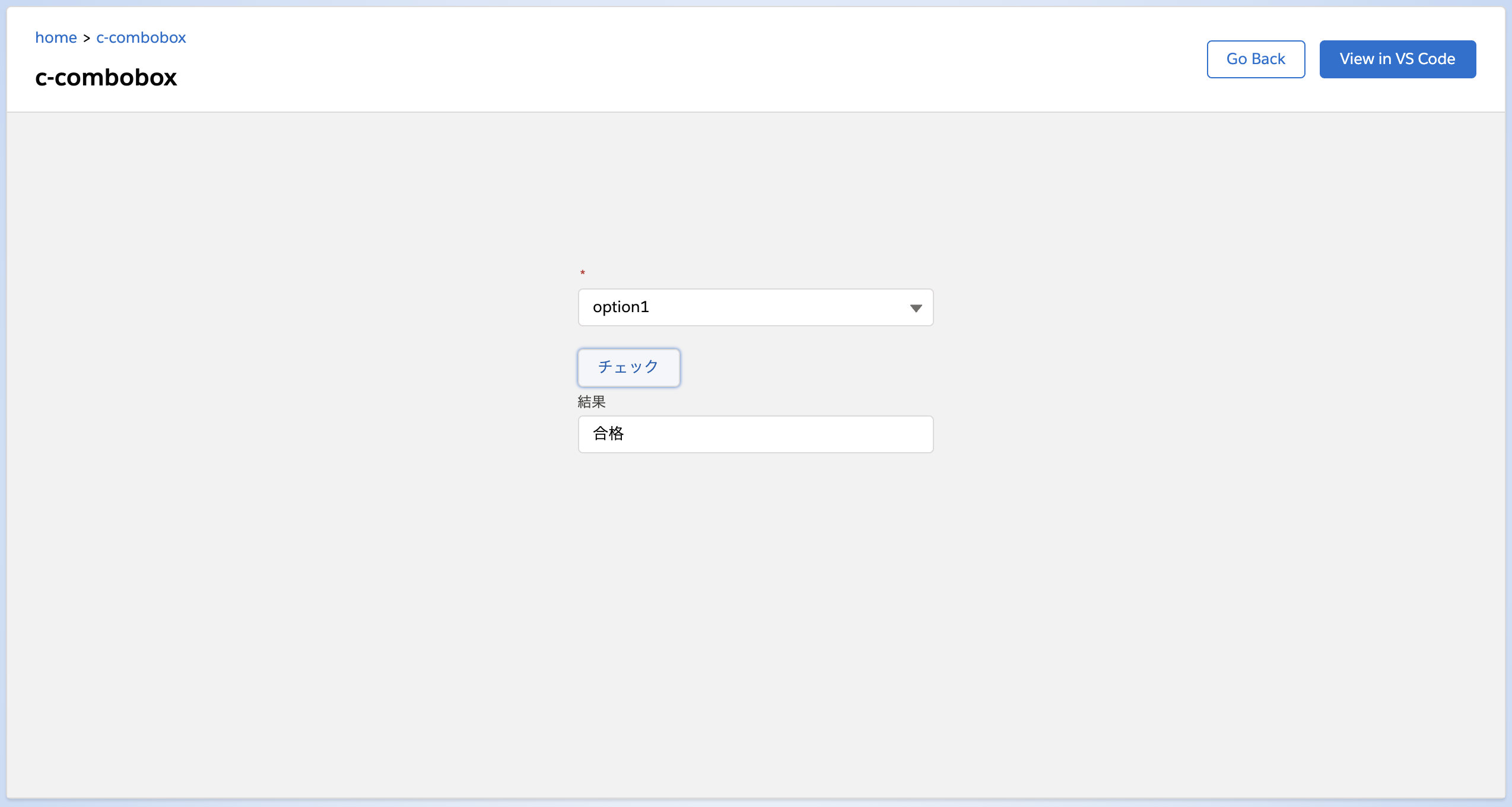
validity
その lightning-combobox のValidityState を表します。
こちらは参照専用なのでJSの中で使います。
参考: https://developer.mozilla.org/ja/docs/Web/API/ValidityState
チェックボタンを押して、 lightning-combobox のチェック結果を表示するものを作ってみました。
lightning-combobox には required をつけているので入力が必須になっています。
1
2
3
4
| <lightning-combobox options={options} required></lightning-combobox>
<br />
<lightning-button onclick={handleClick} label="チェック"></lightning-button>
<lightning-input type="text" value={validmsg} label="結果"></lightning-input>
|
 1
 2
 3
 4
 5
 6
 7
 8
 9
10
11
12
13
14
15
16
17
18
19
20
21
22
23
| import { LightningElement } from 'lwc';
export default class Combobox extends LightningElement {
validmsg = '';
handleClick() {
const v = this.template.querySelector('lightning-combobox').validity;
if (v.valid) {
this.validmsg = '合格';
} else {
this.validmsg = 'エラー'
}
}
get options() {
return [
{ label: 'option1', value: 'option1' },
{ label: 'option2', value: 'option2' },
{ label: 'option3', value: 'option3' },
];
}
}
|
実行するとこんな感じです。
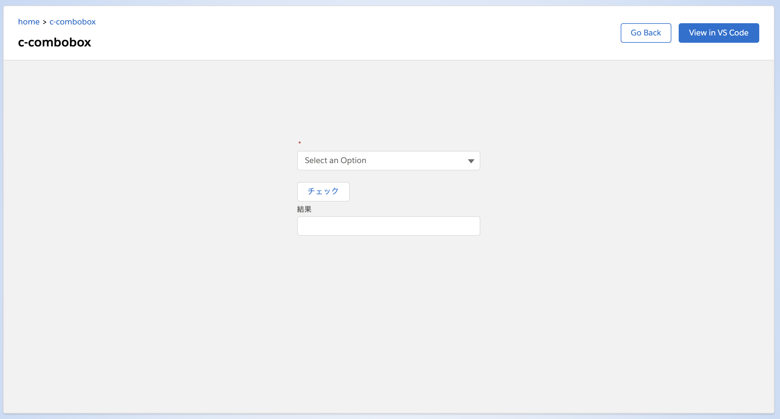
何も選択しないでチェックを押すと「エラー」というメッセージが結果に表示されます。
何か選択してチェックを押すと「合格」というメッセージになりました。
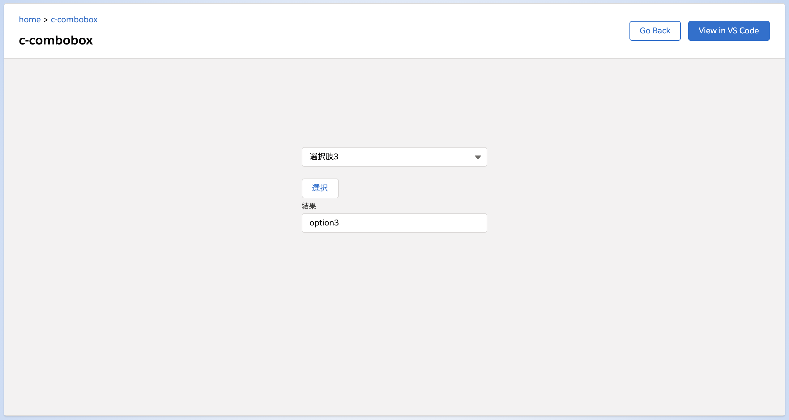
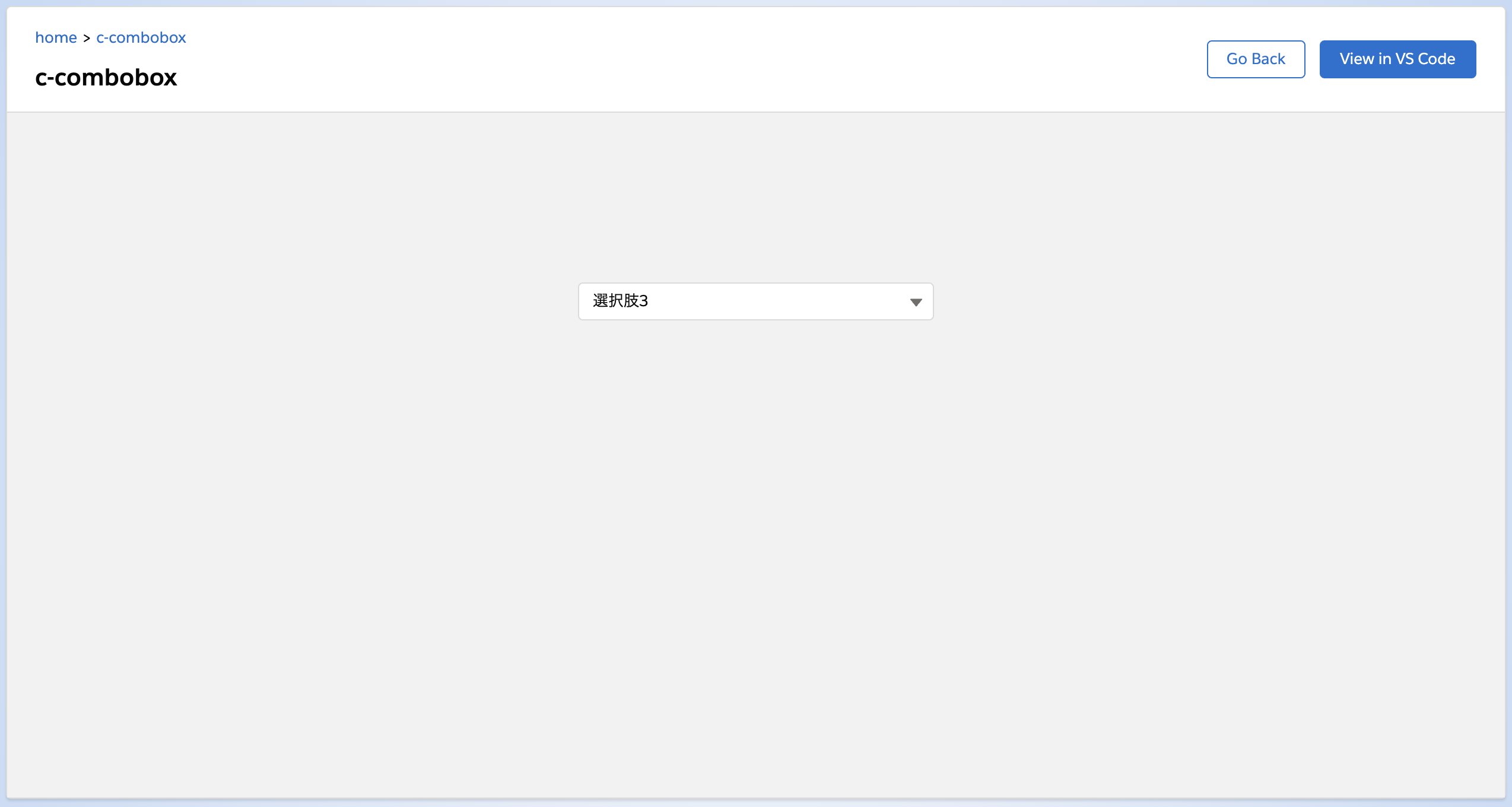
value
ligtning-combobox の値です。
初期値として指定することと、JSの中で参照することができます。
1
2
3
4
| <lightning-combobox options={options} value="option2"></lightning-combobox>
<br />
<lightning-button onclick={handleClick} label="選択"></lightning-button>
<lightning-input type="text" value={msg} label="結果"></lightning-input>
|
 1
 2
 3
 4
 5
 6
 7
 8
 9
10
11
12
13
14
15
16
17
18
| import { LightningElement } from 'lwc';
export default class Combobox extends LightningElement {
msg = '';
handleClick() {
this.msg = this.template.querySelector('lightning-combobox').value;
}
get options() {
return [
{ label: '選択肢1', value: 'option1' },
{ label: '選択肢2', value: 'option2' },
{ label: '選択肢3', value: 'option3' },
];
}
}
|
初期表示では lightning-combobox タグの中で指定した初期値が表示されています。
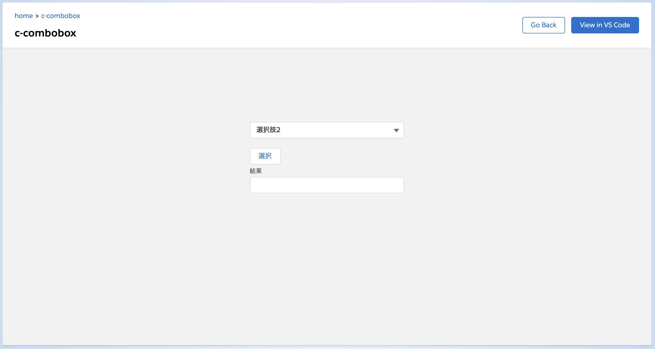
選択リストからなにか選んで選択を押すと、選択リストの value が取れていることがわかります。
JSで初期値を指定
JS内で初期値を指定することもできます(こっちのほうが使われそう)
1
| <lightning-combobox options={options}></lightning-combobox>
|
 1
 2
 3
 4
 5
 6
 7
 8
 9
10
11
12
13
14
15
16
17
18
19
20
21
22
| import { LightningElement } from 'lwc';
export default class Combobox extends LightningElement {
initialized = false;
renderedCallback() {
if (!this.initialized) {
this.initialized = true;
this.template.querySelector('lightning-combobox').value = 'option3';
}
this.initialize();
}
get options() {
return [
{ label: '選択肢1', value: 'option1' },
{ label: '選択肢2', value: 'option2' },
{ label: '選択肢3', value: 'option3' },
];
}
}
|
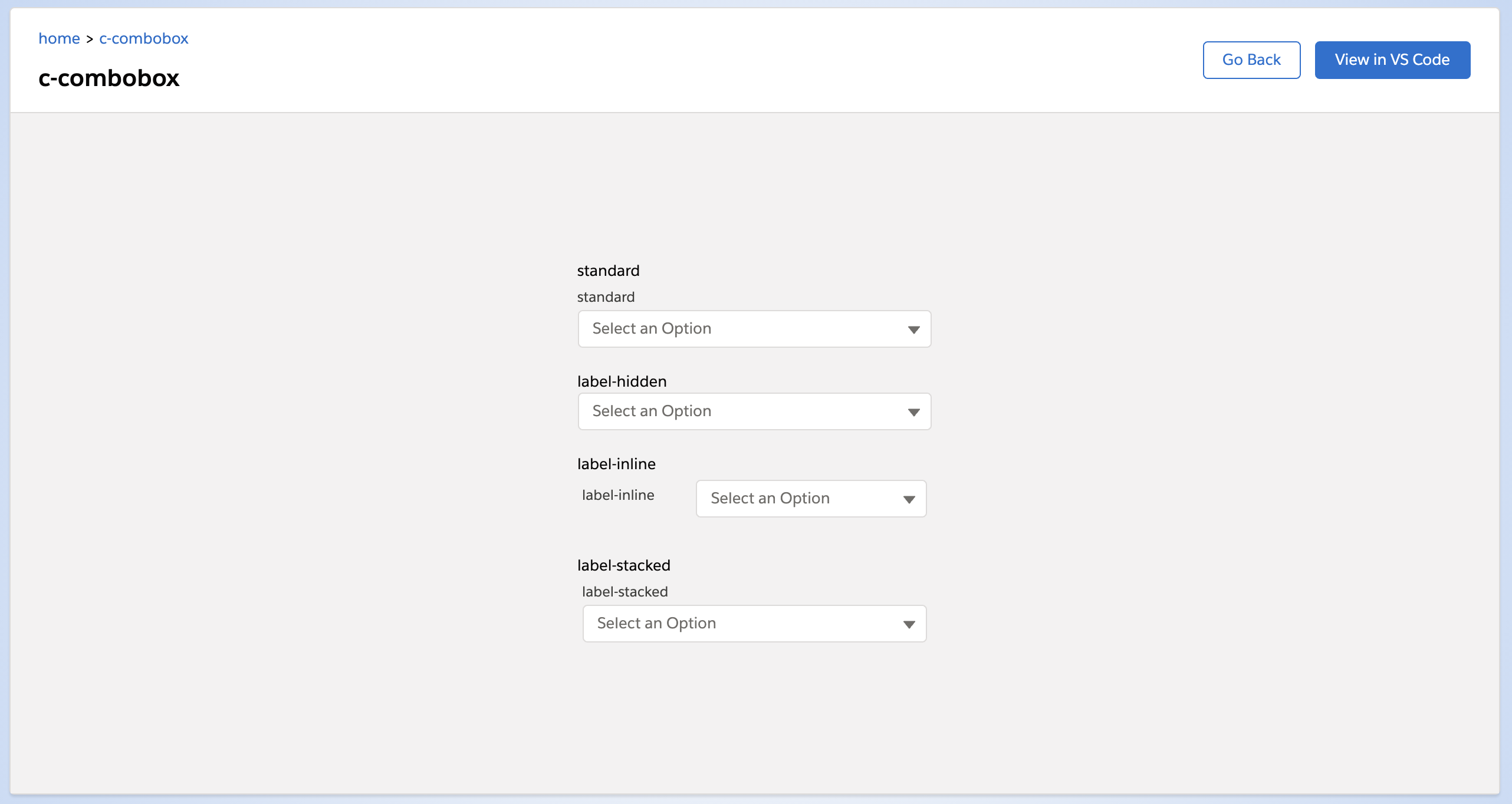
variant
見た目を変えます。
受け取れるパラメータは standard, label-hidden, label-inline, label-stacked です。
デフォルト値は standard です。
 1
 2
 3
 4
 5
 6
 7
 8
 9
10
11
12
13
14
15
16
17
18
19
20
21
22
23
24
25
26
27
| standard
<lightning-combobox
options={options}
variant="standard"
label="standard">
</lightning-combobox>
<br />
label-hidden
<lightning-combobox
options={options}
variant="label-hidden"
label="label-hidden">
</lightning-combobox>
<br />
label-inline
<lightning-combobox
options={options}
variant="label-inline"
label="label-inline">
</lightning-combobox>
<br />
label-stacked
<lightning-combobox
options={options}
variant="label-stacked"
label="label-stacked">
</lightning-combobox>
|
これを見ると standard と stacked は見た目がほぼほぼ同じですね。
method
lightning-combobox のmethodは次のとおり。
blur
フォーカスを外します。
1
2
3
4
| foo() {
const c = this.template.querySelector('lightning-component');
c.blur();
}
|
checkValidity
入力内容の検証を行います。
required があればそれを検証します。
1
2
3
4
5
6
7
8
| foo() {
const c = this.template.querySelector('lightning-component');
if (c.checkValidity()) {
console.log('ok');
} else {
console.log('ng');
}
}
|
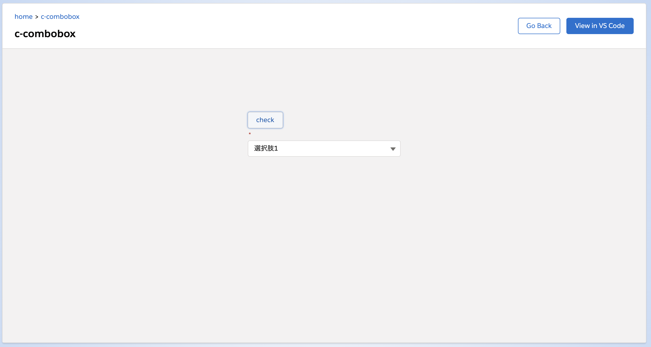
reportValidity
入力内容の検証結果を表示します。
検証内容が問題なかった場合、エラーメッセージは消されます。
また、 true が返るのでsubmit時の事前チェックに使うことができそうです。
1
2
| <lightning-button label="check" onclick={handleClick}></lightning-button>
<lightning-combobox options={options} required></lightning-combobox>
|
 1
 2
 3
 4
 5
 6
 7
 8
 9
10
11
12
13
14
15
16
17
| import { LightningElement } from 'lwc';
export default class Combobox extends LightningElement {
handleClick() {
const c = this.template.querySelector('lightning-combobox');
c.reportValidity();
}
get options() {
return [
{ label: '選択肢1', value: 'option1' },
{ label: '選択肢2', value: 'option2' },
{ label: '選択肢3', value: 'option3' },
];
}
}
|
初期表示
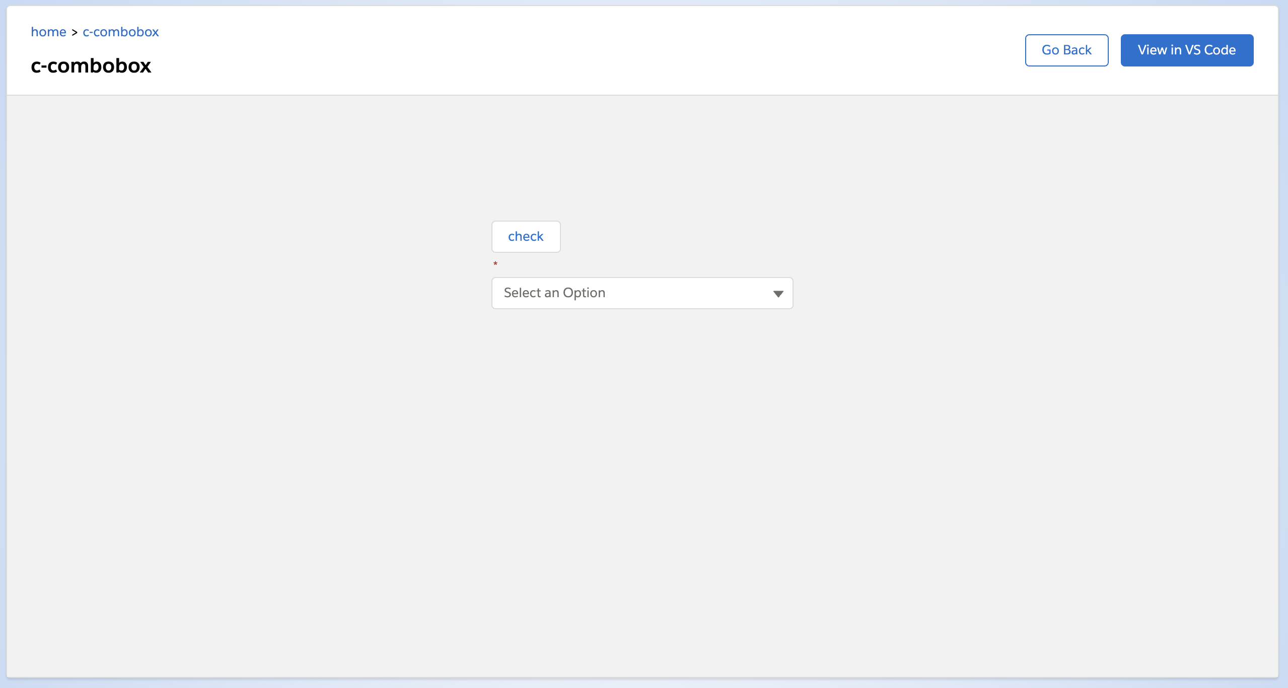
required があるので、何も選択がない状態で reportValidity を実行すると、エラーメッセージが表示されます。

何か選択して reportValidity を実行するとエラーメッセージは消えます。
setCustomValidity
カスタムのエラーメッセージを設定することができます。
 1
 2
 3
 4
 5
 6
 7
 8
 9
10
11
12
13
14
15
16
17
18
19
20
21
22
23
24
25
26
| import { LightningElement } from 'lwc';
export default class Combobox extends LightningElement {
initialized = false;
renderedCallback() {
if (!this.initialized) {
this.initialized = true;
const c = this.template.querySelector('lightning-combobox');
c.setCustomValidity("エラーです");
}
}
handleClick() {
const c = this.template.querySelector('lightning-combobox');
c.reportValidity();
}
get options() {
return [
{ label: '選択肢1', value: 'option1' },
{ label: '選択肢2', value: 'option2' },
{ label: '選択肢3', value: 'option3' },
];
}
}
|
こんなエラーメッセージの表示になります(ってメッセージ以外は変わらない)。
showHelpMessageIfInvalid
入力内容の検証結果を表示します。
検証内容が問題なかった場合、エラーメッセージは消されます。
reportValidity はチェック結果をBooleanで返しますが、 showHelpMessageIfInvalid はチェック結果を返しません。
 1
 2
 3
 4
 5
 6
 7
 8
 9
10
11
12
13
14
15
16
17
| import { LightningElement } from 'lwc';
export default class Combobox extends LightningElement {
handleClick() {
const c = this.template.querySelector('lightning-combobox');
c.showHelpMessageIfInvalid();
}
get options() {
return [
{ label: '選択肢1', value: 'option1' },
{ label: '選択肢2', value: 'option2' },
{ label: '選択肢3', value: 'option3' },
];
}
}
|
参考元
- Component Reference
- https://developer.salesforce.com/docs/component-library/bundle/lightning-combobox/specification